Creating a custom shirt should be fun, but small mistakes can affect how the finished product looks and feels. This article covers the most common custom shirt design mistakes and explains how to avoid them before your design goes to print.
Design Mistakes to Avoid When Creating Custom Shirts
Planning your design before printing is one of the best ways to create a shirt that looks professional and lasts for years.
Whether you are designing shirts for a business, sports team, event, or personal use, avoiding a common custom shirt design mistake can save both time and money.
Simple decisions about colors, artwork, fonts, and placement all make a noticeable difference in the final product.
Taking time to review every part of your design before printing greatly improves the chances of receiving a shirt you will be proud to wear. Many design problems are easy to fix during the planning stage, but become expensive once production begins.
Paying attention to the details allows your custom shirts to stand out for the right reasons instead of obvious design flaws.
Avoid Font Styles That Are Difficult to Read
Choosing decorative fonts may seem creative, but readability should always come first.
Another frequent custom shirt design mistake happens when script fonts, thin lettering, or overly artistic typefaces make the words difficult to understand. If someone cannot quickly read the message, the design loses much of its effectiveness.
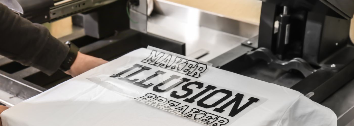
Select fonts that match the style of the shirt while remaining clear at different viewing distances. Easy-to-read lettering helps your design communicate its purpose immediately without forcing people to guess what it says.
Testing your design by viewing it from several feet away is a simple way to confirm that the text remains readable before printing.
Don’t Overcrowd the Design With Too Many Visual Elements
One common custom shirt design mistake is trying to fit too many graphics, logos, icons, and text onto one shirt. While every idea may seem important, combining everything into a single design often creates visual clutter.
Instead of grabbing attention, an overloaded design can confuse people and make it difficult to understand the overall message.
A clean design with enough open space usually creates a stronger visual impact than one filled from edge to edge.
Focus on one primary graphic or message and allow supporting elements to complement it instead of competing for attention. Simple layouts are easier to recognize from a distance and often leave a longer-lasting impression.
Eliminate Low-Resolution Artwork
Artwork quality plays a major role in how professional a shirt appears after printing. A common custom shirt design mistake is using images copied from websites or screenshots that were never intended for large-format printing.
Low-resolution graphics often appear blurry, pixelated, or jagged once transferred onto fabric.
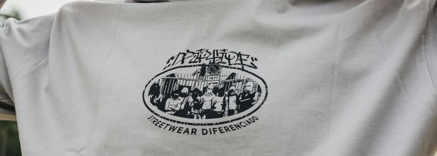
Starting with high-quality artwork gives printers the best opportunity to produce crisp details and smooth edges. Whenever possible, use vector files or high-resolution images supplied by a designer.
Investing in quality artwork before production usually delivers far better results than trying to fix poor images after the design has already been created.
Not Recognizing the Shirt Color Contrast
Color choices can completely change the appearance of a printed shirt. Another custom shirt design mistake occurs when the artwork blends into the shirt instead of standing out.
Dark graphics on dark shirts or light graphics on light fabrics reduce visibility and make important design elements disappear.
Always preview the artwork against the exact shirt color before approving production. Strong contrast allows every graphic, logo, and line of text to remain visible under different lighting conditions.
Even colorful designs benefit from thoughtful color selection because the right combination creates a cleaner and more attractive finished product.
Poor Placement Can Hurt Your Design
Even an excellent graphic can look awkward if it is placed incorrectly on the shirt. A common custom shirt design mistake involves printing artwork too high, too low, or at the wrong size for the garment.
Placement affects overall balance and can make the design appear unprofessional even when the artwork itself is well created.
Before final production, review digital mockups that show the artwork positioned on the actual shirt style and size.
Carefully planned placement helps every part of the design look balanced while creating a polished final appearance.
Taking a few extra minutes to verify positioning ensures your custom shirts look intentional, comfortable, and visually appealing from every angle.